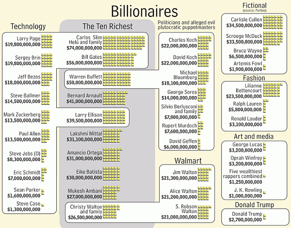
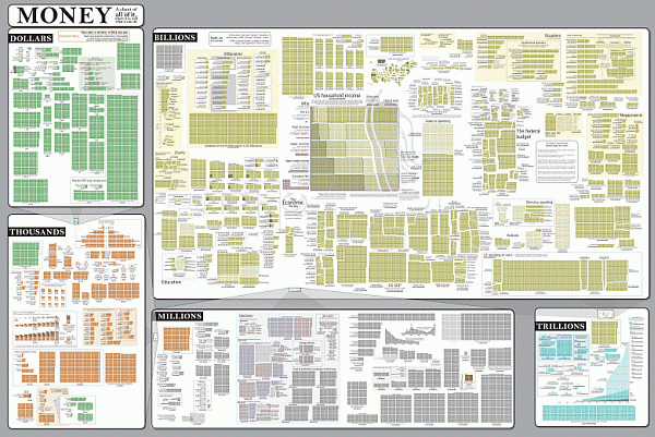
Audrey Watters writes: Randall Monroe of xkcd has created an infographic titled “Money: A Chart of Almost All of It, Where It Is and What It Can Do.” It’s an incredible visualization representing trillions of dollars — what money is spent on (everything from iPads to charity to federal expenditures), and how money is earned (for individuals, corporations, charities, governments, etc.).
Click on either image below to study the full chart:


