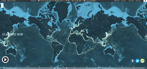
Click on the image above to view a data visualization of the world’s shipping routes created by Kiln studio and the UCL Energy Institute. Click the play button to follow a guided tour around the map. (Note: this data visualization web page uses a lot of memory — you might experience problems if you’re using an old computer and/or have a slow internet connection.)
What can I see?
You can see movements of the global merchant fleet over the course of 2012, overlaid on a bathymetric map. You can also see a few statistics such as a counter for emitted CO2 (in thousand tonnes) and maximum freight carried by represented vessels (varying units).
What can I do?
You can pan and zoom in the usual ways, and skip back and forward in time using the timeline at the bottom of the screen. The controls at the top right let you show and hide different map layers: port names, the background map, routes (a plot of all recorded vessel positions), and the animated ships view. There are also controls for filtering and colouring by vessel type.
What the are types of ships shown?
The merchant fleet is divided into five categories, each of which has a filter and a CO2 and freight counter for the hour shown on the clock. The ship types and units are as follows:
- Container (e.g. manufactured goods): number of container slots equivalent to 20 feet (i.e. a 40-foot container takes two slots)
- Dry bulk (e.g. coal, aggregates): combined weight of cargo, fuel, water, provisions, passengers and crew a vessel can carry, measured in thousand tonnes
- Tanker (e.g. oil, chemicals): same as dry bulk
- Gas bulk (e.g. liquified natural gas): capacity for gases, measured in cubic metres
- Vehicles (e.g. cars): same as dry bulk
Why do ships sometimes appear to move across land?
In some cases this is because there are ships navigating via canals or rivers that aren’t visible on the map. Generally, though, this effect is an artefact of animating a ship between two recorded positions with missing data between, especially when the positions are separated by a narrow strip of land. We may develop the map to remove this effect in the future.
Why are there fewer ships visible in the first part of the year?
Unfortunately the data we are using for the map is incomplete for the first few months of the year: roughly January to April.


